Driscoll Children's Hospital
The Challenge:
The project required turning a dense, data-heavy health report into a visually engaging and easy-to-navigate document while staying true to Driscoll Health System’s brand. With over 80 pages of content, multiple spotlight sections, and numerous data visualizations, the biggest challenge was maintaining clarity and visual hierarchy without overwhelming the reader.
The Solution:
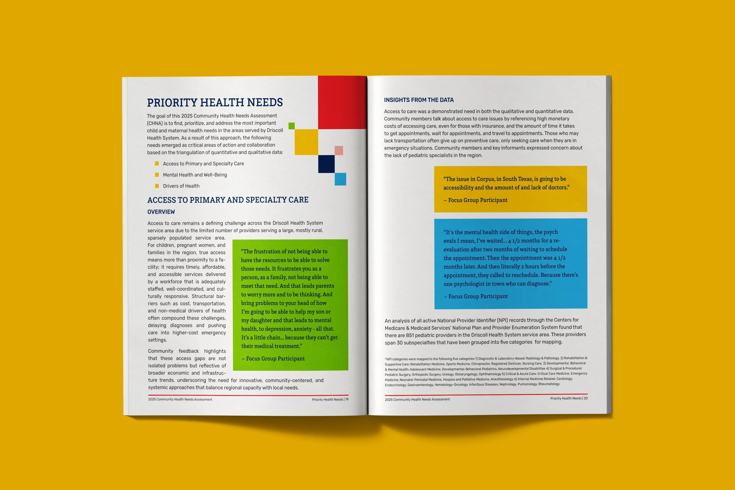
I developed a clean, cohesive layout system guided by the organization’s branding, ensuring consistency across charts, typography, and imagery. To help readers navigate seamlessly, I implemented color-coded section markers along the bottom of each page and used distinct color treatments for spotlight sections to visually separate them from the main content. I also created all charts and infographics from scratch, using color and hierarchy strategically to present complex data in a way that felt approachable and accurate.
The result was a polished, accessible report that balanced data visualization, narrative storytelling, and brand cohesion — turning a complex health assessment into a publication that communicates clearly and effectively.
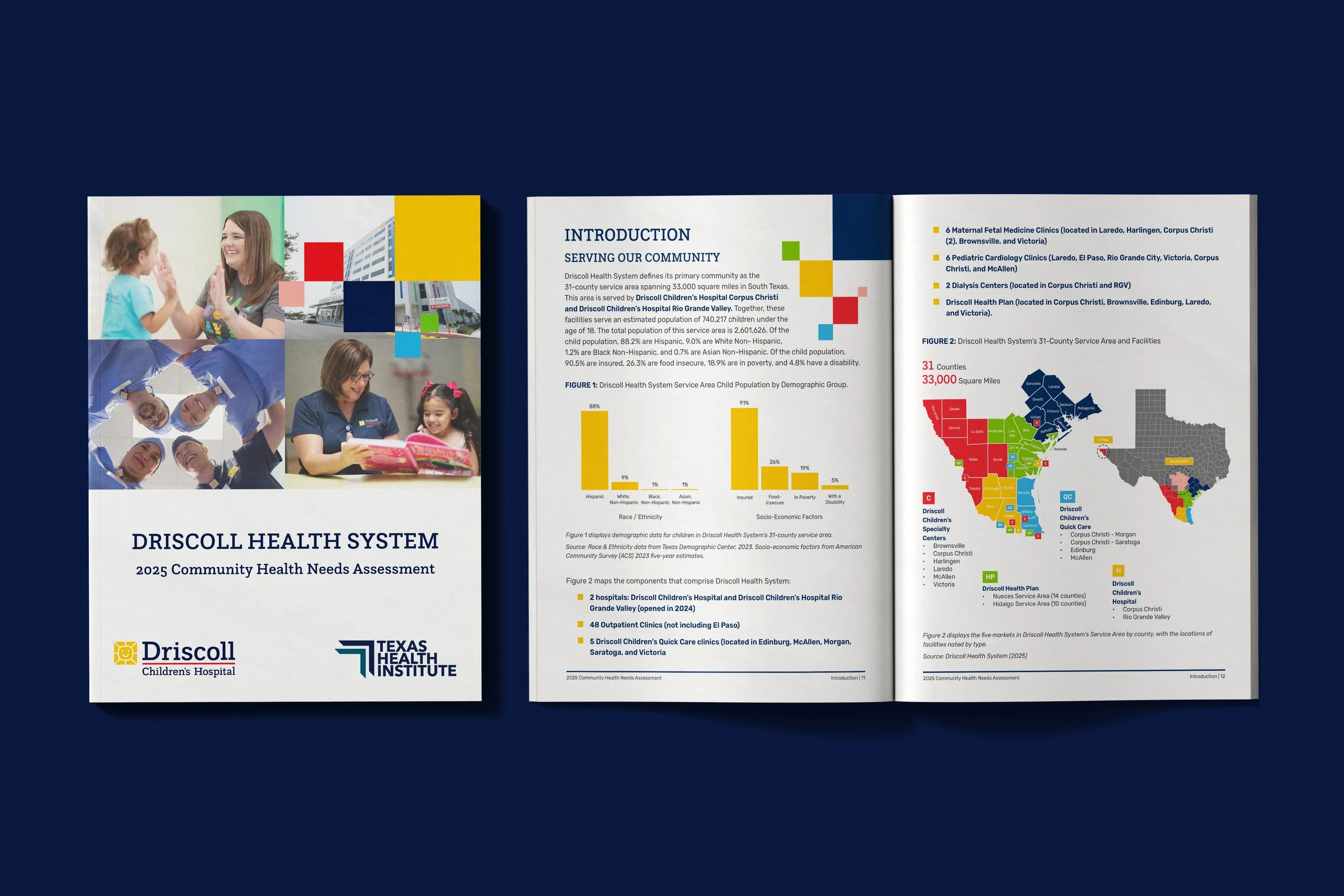
I partnered with Texas Health Institute to design the Community Health Needs Assessment (CHNA) report for the Driscoll Health System — a 100+ page publication summarizing key health indicators, community insights, and data visualizations across multiple counties in South Texas.
The report adheres closely to Driscoll Health System’s established brand standards while introducing new visual elements to improve navigation and readability. Each section is color-coded using a line along the bottom margin to orient readers throughout the document. Spotlight sections were differentiated using alternate color palettes and layouts, clearly setting them apart as standalone highlights.
I designed every chart, infographic, and visual element from raw data, ensuring a clean, accessible presentation that supports both print and digital viewing.
Key Features:
100+ page report layout and typesetting
15+ custom charts and infographics
WCAG 2.2 AA accessibility compliance
Section color system for navigation
Visual distinction for spotlight content
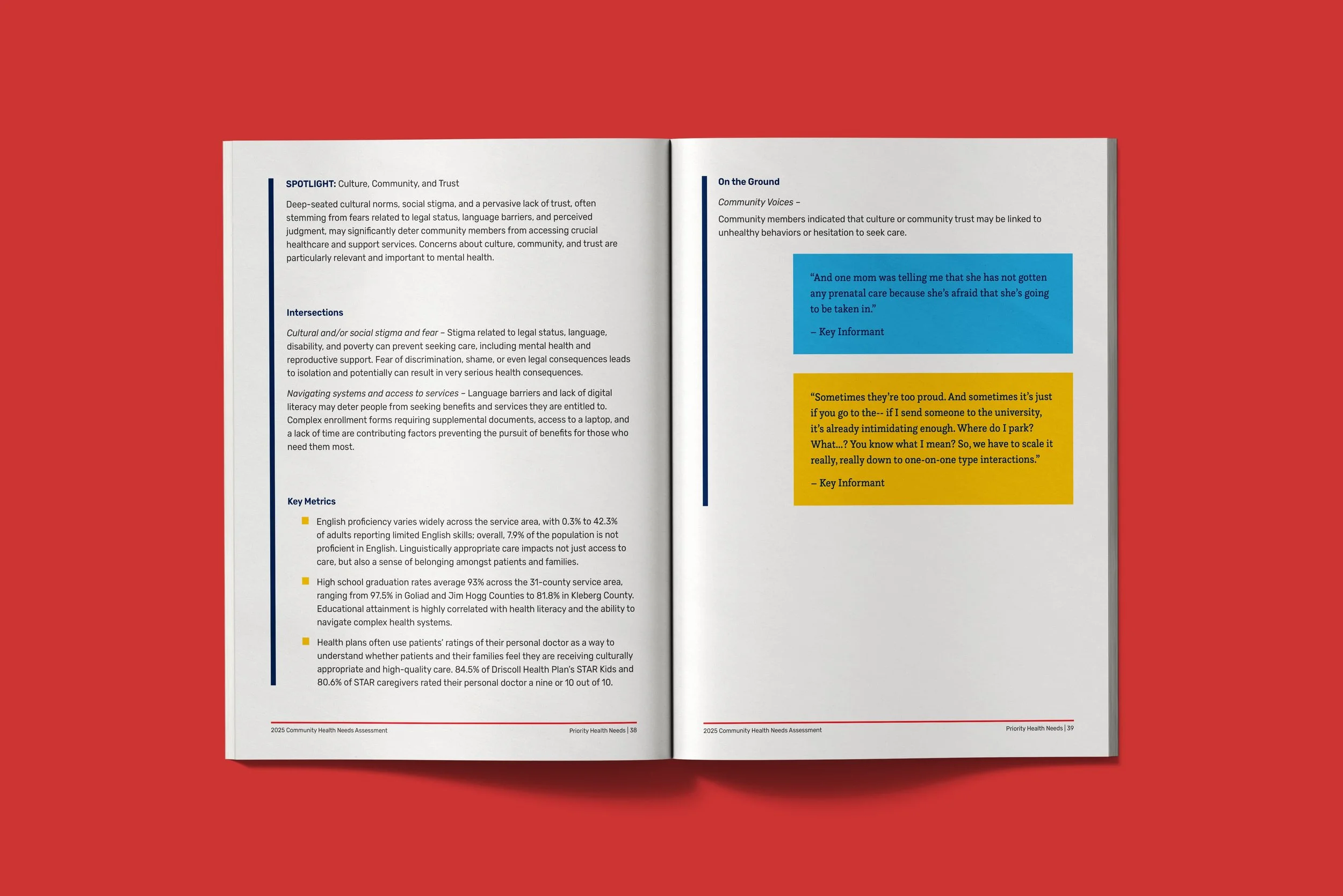
To visually distinguish the Spotlight sections from the main report content, I introduced a set of vertical color bars unique to each spotlight. These act as a visual cue that the reader has entered a different type of content, while still feeling cohesive with the overall brand system. It was a simple solution that made these high-importance sections easy to identify at a glance.
View the interactive report below:
*Note: This report was designed to be viewed online, not as a magazine style so this file is not set for printing.